 "Urambo Tauro" (urambotauro)
02/15/2018 at 12:00 • Filed to: infrastructure, design, driving, Embiggen this
 6
6
 7
7|
"Urambo Tauro" (urambotauro)
02/15/2018 at 12:00 • Filed to: infrastructure, design, driving, Embiggen this | 6
| 7 |
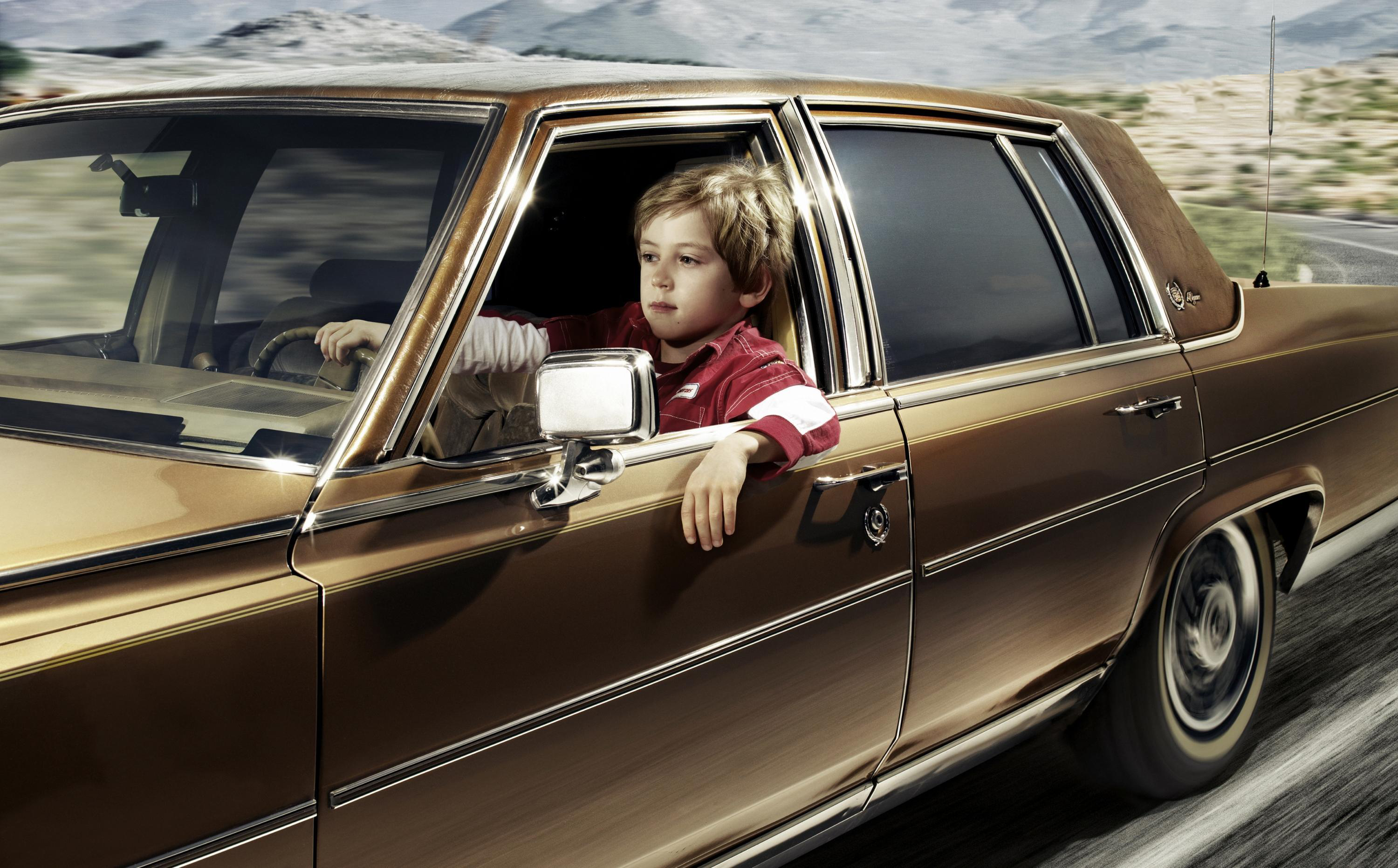
Some say that driving is difficult. Videos of automotive operator error pop up every day. Here are some ways modern infrastructure is designed to make driving easy.
This post originally appeared on July 23, 2015.
!!! UNKNOWN CONTENT TYPE !!!
Playthings
Let’s start by looking at children’s toys. When a kid’s version of a grown-up item is designed, there two major differences. A toy phone is a good example:
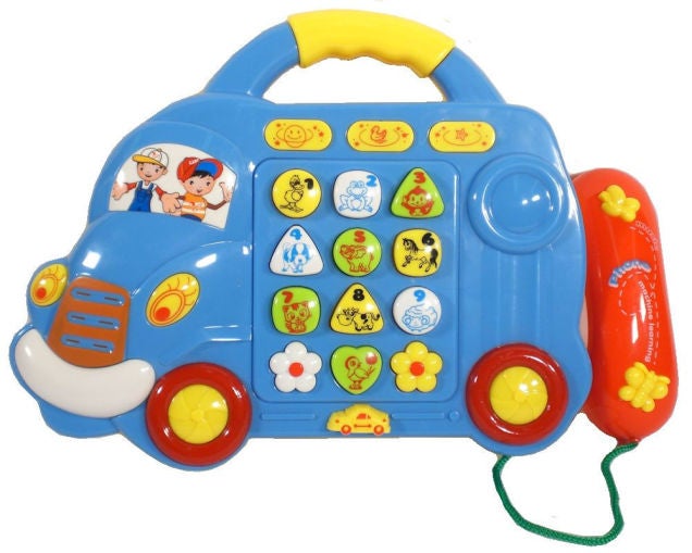
1. Everything is super-sized.
Just look at those buttons. They’re huge! You and I could navigate the tiny keyboard of a Blackberry with minimal misspellings. But children are still practicing their motor skills, and this helps them select one button at a time. By moving their arm towards a number, the kid stands a good chance of pressing the button they were aiming for. As they develop more skill in using their elbow, wrist, and fingers, precision becomes much easier. But for now, large features make hitting the target a cakewalk.
2. Colors!
The other thing that stands out to make an object instantly recognizable as a toy is its array of colors. Bright, distinctive colors too, and kids love this. It also helps with learning. Before they learn their numbers, kids start recognizing colors. Even if they haven’t developed the language skills to name those colors, they can tell the difference between red and blue.
Even as our tastes mature, bright colors still help greatly to draw instant visual attention. Colors continue to be extremely helpful to adults. When reading statistical graphs and charts, color-coding helps the eye jump to the data you are looking for.
!!! UNKNOWN CONTENT TYPE !!!
!!! UNKNOWN HEADER TYPE (MULTI-LINE BREAK?) !!!
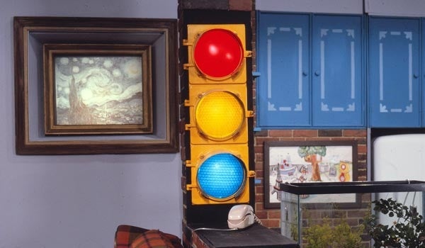
With a large degree of consistency, traffic control devices are color-coded in the US. And the colors are organized in a natural fashion to help you find the information you’re looking for.
White
signs are
regulatory
; they’re important and require your attention. That new lane that appears on the right? It’s just a right turn (only) lane, so don’t get excited. Speed limit and passing zone signs are also white. There is no greater contrast than white and black when it comes to signage. Can’t miss it; don’t ignore it.
Red
is a color that traditionally symbolizes
danger
. Fire and blood are natural elements that support this. Serious injury could await one who ignores a stop, yield, or do-not-enter sign.
Yellow
catches one’s attention in a similar way, but its meaning is toned down. Danger is still possible, but not likely, so yellow is used for
warning
signs. Deer crossing? Not right now. The bridge is 14’8”? Yeah, I think I can fit.
Other colors are less critical, but help to codify the information they provide. Green guide signs help you find your way. Blue service signs lead to hospitals, food, gas, lodging, etc.
FUN FACT: In 1966, China decided red was the color of progress , and swapped the meanings of red and green on traffic signals. !!!error: Indecipherable SUB-paragraph formatting!!!
And let’s not forget everyone’s favorite color orange ... Just ask !!!error: Indecipherable SUB-paragraph formatting!!! .
!!! UNKNOWN CONTENT TYPE !!!
Everything’s biiiig in Texas
Like children’s toys, modern roads and accompanying features are also built to generous size.
Lanes
Most US highways have a minimum lane width of 12 feet. Sorry, was that a typo? I meant to say TWELVE feet. Most large trucks are just over 8 feet wide, and most of us drive cars that are 6 feet or less in width. That’s merely half of the lane! How long would you guess the broken lines in the road are? Would you believe close to ten feet?
Intersections
You see that bozo who stopped at the red light waaaay past the stop line? He’s even beyond the crosswalk. But he’s not blocking cross-traffic. How is that possible? Why is the stop line so far back? Intersections are designed with extra room for turning left and right, and if you ever drive anything with a trailer, you know you need that extra room. But that’s not the only reason; visibility is a major factor, too.
Signs
More optical illusions here. From the driver seat, a stop sign might appear to stand about 6 feet tall. But walk up to it and you will find that it’s closer to 8, plus the street sign mounted above it.
A regular-size speed limit or “pass with care” sign appears to be the size of an 8.5” x 11” piece of paper, but the smaller ones are actually more than double that- 18” x 24”.
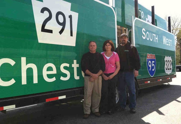
Larger signs appear to be the size of, say, a suitcase, but you would have a hard time fitting one into your car (um- don’t ask). Some freeway signs are made up of multiple large sheets. Although the size of these signs don’t affect your driving, being able to read them quickly from a distance allows the driver more time to make decisions, like choosing the proper lane.
!!! UNKNOWN CONTENT TYPE !!!
Conclusion
We don’t need this rainbow of colors, but they are extremely helpful, even if only on a subliminal level. And the vehicles most of us drive don’t need all this extra room, but it comes in handy. It can be hard to drive in a perfectly straight line, in the exact center of the lane. But preventing wrecks and keeping your car in one lane is easy enough. Why, it’s elementary.
 thebigbossyboss
> Urambo Tauro
thebigbossyboss
> Urambo Tauro
07/23/2015 at 09:05 |
|
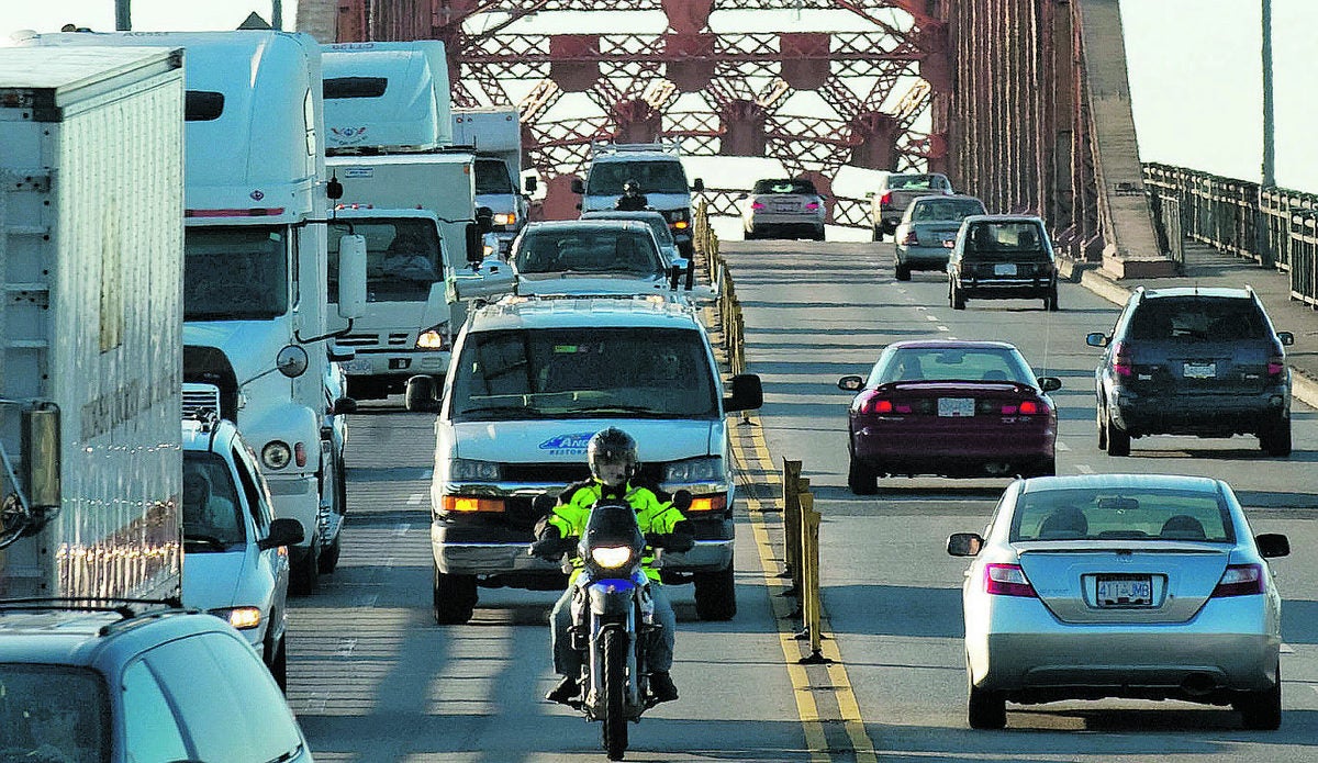
Welcome to Oppositelock. Lane widths are important but they weren’t always quite as wide. case. Here is one bridge notorious for collisions near where I grew up.
The Pattullo Bridge has four traffic lanes, but the lane widths are below current guidelines. The width between the bridge arches of the main span is 12.1 metres, which limits the outside traffic lanes to 3 metres and the inside traffic lanes to 2.9 metres, leaving only 0.3 metres for the centreline indicators.
Here it is.
|
Urambo Tauro
> thebigbossyboss
07/23/2015 at 09:15 |
|
There are many roads that were built before those guidelines were put in place, but in many cases its impractical or even impossible to alter them. Imagine the consequences of reducing the Pattullo Bridge down to two lanes, just to meet the current guidelines...
|
thebigbossyboss
> Urambo Tauro
07/23/2015 at 09:18 |
|
No I refuse to imagine a traffic jam that long. Things seemed to have calmed down on that bridge there was about 10 fatalities from 1999-2006 or something but they started reducing it to two lanes from 10pm to 5am and the number has decreased.
 CarsofFortLangley - Oppo Forever
> thebigbossyboss
CarsofFortLangley - Oppo Forever
> thebigbossyboss
02/15/2018 at 12:12 |
|
Oh gross. The Pattullo
 promoted by the color red
> thebigbossyboss
promoted by the color red
> thebigbossyboss
02/15/2018 at 12:20 |
|
I used to commute on the Golden Gate bridge just as they were transitioning over to the moving lane barrier system. It was a little heart-pounding when it was just those little yellow barriers and you had to share space with tourists who didn’t set their mirrors up right.
 MasterMario - Keeper of the V8s
> Urambo Tauro
MasterMario - Keeper of the V8s
> Urambo Tauro
02/15/2018 at 12:24 |
|
You bring up an interesting topic that may be worth an “embiggening”(if I ever researched and wrote it)...the fact that road designs have been focusing on what seems safe (wide lanes, good visibility, slower speed limits) that may actually do the opposite in the end.
|
Urambo Tauro
> MasterMario - Keeper of the V8s
02/15/2018 at 12:58 |
|
I think you would really like Tom Vanderbilt’s Traffic: Why We Drive the Way We Do (and What It Says About Us) , particularly the chapter on “When Dangerous Roads Are Safer”. I found a copy of it at my local library.